Ontario’s Climate Change Update 2014
This report provides an update of Ontario’s greenhouse gas emissions (GHGs) and progress towards the targets set out in the 2007 Climate Change Action Plan.
Minister’s Message
Climate change is a tremendous force disrupting and challenging every facet of our lives, from our homes and businesses to the activities, food and places we enjoy and often take for granted. We must act now to protect our health, wellbeing and work together towards a cleaner, brighter future.
Ontario has the skills, technological knowledge and capacity to be a world leader in finding and demonstrating solutions to climate change.
Where we live, where we work and how we move between our homes and our jobs determines the largest share of our greenhouse gas emissions. To keep reducing emissions with a growing population, we need to build for the future. More energy-efficient buildings, smart urban planning, low-carbon transportation options, and green infrastructure are just some of the solutions we need. And, as the world transitions to a low carbon economy, we need to design products for our children, not the dump.
Our government is already making strides in all of these areas – through investments in transit, our regional planning initiatives, and our energy and environmental policies, and there is more to do.
This report reflects on Ontario’s actions towards addressing climate change and I am proud of the progress we have made to date. However, our government has set important targets for 2020 and 2050 that will require new approaches to adaptation, mitigation and science.
Let’s rise to the challenge of fighting climate change and leave future generations with an essential legacy: a healthy and beautiful planet.

Glen Murray
Minister of the Environment and Climate Change
This Report
Ontario reports regularly on climate change progress. Regular, transparent reporting supports the observation of trends in the economy and society that influence greenhouse gas emissions. In addition, it enables the assessment of policies, programs and other actions as well as the forecasting of future trends. Finally, the report helps to highlight areas for further action.
This report provides an update of Ontario’s greenhouse gas emissions (GHGs) and progress towards the targets set out in the 2007 Climate Change Action Plan.
- 2014 target: 6% below 1990 levels
- 2020 target: 15% below 1990 levels
- 2050 target: 80% below 1990 levels
We determined these targets as part of a coordinated global effort to avoid the dangerous impacts of climate change on our planet and quality of life, but also to help ensure a cleaner future for Ontario.
We expect to achieve our 2014 target, the first of three targets set out in the province’s plan. While we are more than two thirds of the way to meeting our 2020 target, we know we have to act quickly to meet the target. Ontario uses 1990 as a base year for its targets, which is common practice and aligns with the United Nations Framework Convention on Climate Change (UNFCCC) and the Kyoto Protocol. Some jurisdictions such as the Government of Canada (which uses 2005) have adopted different base years for targets. All nations reporting to the UNFCCC report historical emissions back to 1990.
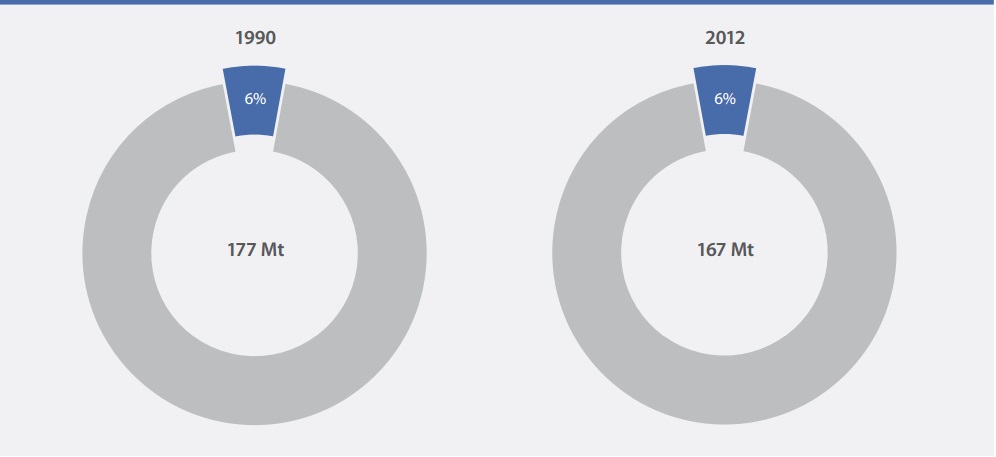
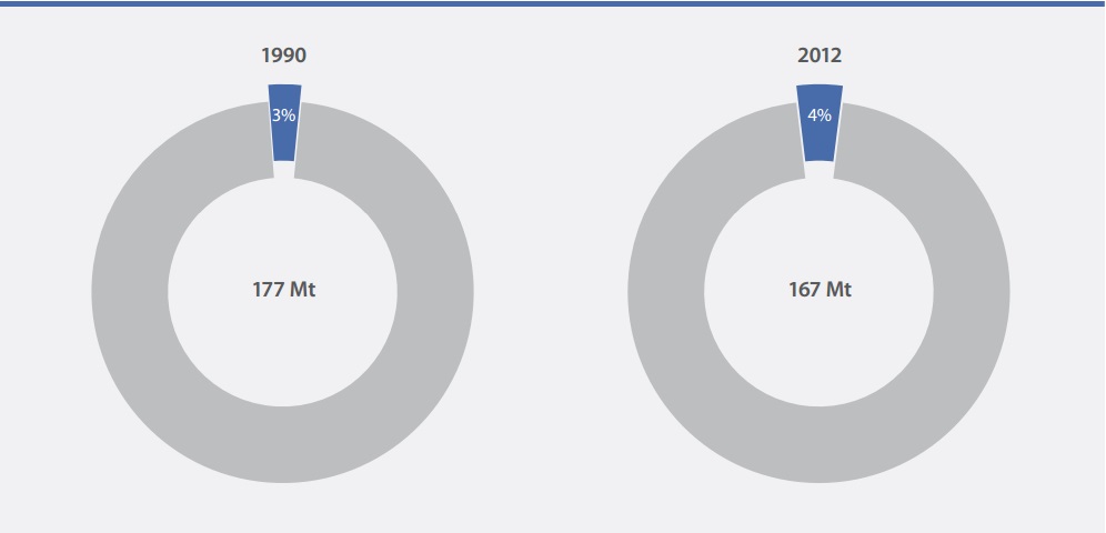
In 1990, GHG emissions in Ontario were 177 megatonnes (Mt). In 2012, according to the Government of Canada’s latest National Inventory Report (the Inventory), emissions in Ontario were down to 167 Mt (or 5.9%
Total GHG emissions forecast for 2014 are 165 Mt, which is below the target of 167 Mt. This means Ontario is expected to not only achieve, but surpass its 2014 target. Given current policies and trends, emissions in 2020 are forecast to be 170 Mt — which would achieve 69% of the emission reductions required
Overview of Sections
The information presented in this report is based on Environment Canada’s National Inventory Report 1990 to 2012: Greenhouse Gases Sources and Sinks, released in April 2014.
- Section 1: Summarizes the major sources of emissions in the province, long- and short-term trends, and the province’s updated emission forecasts to 2014, 2020 and 2030.
- Section 2: Breaks down emissions by sector — discussing the key factors influencing GHG emissions and the impacts of specific policies.
- Section 3: Describes the modelling approach and associated uncertainty.
Section 1: Economy-Wide Emission Trends And Forecast
Sources of Emissions
Ontario’s estimated GHG emissions comprise GHGs that are emitted within the province’s boundaries — for instance, from buildings, vehicles and industrial plants operating in Ontario.
Estimated GHG emissions do not include “consumption-based emissions” from the production of fuels, goods and services outside the province that are bought or consumed inside Ontario. This approach to estimating GHGs is consistent with most other jurisdictions, including the Government of Canada.
GHG emissions come from virtually all aspects of Ontario’s society and economy. The main sources by far are the fossil fuels used to heat homes, run vehicles, power industries and generate electricity. But GHGs also come from waste disposed in landfills, some industrial processes, livestock, fertilizer use, and from appliances leaking refrigerants. In this report, sources are categorized into the economic sectors described in Table 1 (further detail is also provided in Section 3: Methodology).
| Sector | Sources of Greenhouse Gas Emissions |
|---|---|
| Transportation | The combustion of fossil fuels such as diesel, gasoline and propane by passenger and commercial vehicles on and off roads, as well as rail and Ontario’s share of domestic marine and air travel |
| Industry | Some industrial processes and stationary combustion of fossil fuels such as coke, natural gas and coal used in mining; pipelines; construction; greenhouses; production of cement, iron and steel, chemicals, paper and wood products; and other manufacturing |
| Buildings | The combustion of fossil fuels such as natural gas in residential, commercial and institutional buildings for space and water heating |
| Electricity | Generating electricity and heat by electric utilities using fossil fuels such as natural gas |
| Agriculture | Enteric fermentation, manure management and fertilizer application |
| Waste | Solid waste disposal on land, wastewater handling and waste incineration |
The “land use, land use change and forestry” sector also plays an important role in both adding GHGs to and removing GHGs from the atmosphere.This sector reflects the role of forests, grasslands, croplands, wetlands and settlements in the carbon cycle. Forests and other lands can absorb and store carbon for long periods — these are known as carbon sinks. However, carbon sinks can also release carbon back into the atmosphere as conditions change and organic material degrades. Many of these processes are natural; however, how forests and croplands are managed and land use is changed from forest to agricultural lands or other uses can have a climate impact. The federal government models and reports these emissions and removals at a national level in the National Inventory Report. However, in accordance with UN accounting conventions, Canada’s emissions and removals of GHGs from the Land Use, Land Use Change and Forestry sector are not included in Canada’s National Inventory totals. Therefore, these sources and sinks are not included in Ontario’s assessment of GHGs at this time. As better data become available, Ontario will consider how to incorporate these into its accounting and targets.
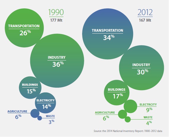
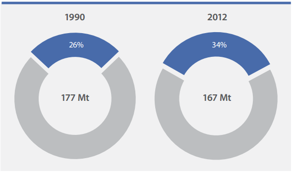
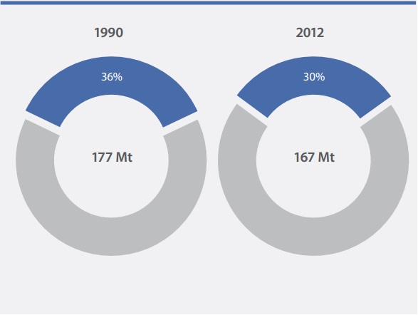
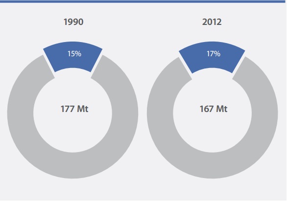
Figure 1 - Emissions by Sector, 1990 and 2012
Ontario’s emissions in 2012
For 2012, Ontario’s GHG emissions are estimated to be 167 megatonnes (Mt). The 1990 and 2012 shares of emissions by sector are shown in Figure 1. Over these 22 years, the distribution of emissions by sector in Ontario has changed, reflecting changes in the economy and the electricity sector. The share of emissions in the transportation sector has grown from 26% in 1990 to 34% in 2012, while the share of industrial emissions has declined from 36% to 30%. Note that 2012 emissions do not yet reflect the full impact of the closure of coal-fired electricity in the province.
Long-term trends in Ontario’s emissions (1990 to 2012)
Figure 2 shows the percentage changes in emissions from 1990 to 2012.
Figure 2 - Long-Term Changes in Ontario Emissions by Sector, 1990 to 2012
Greenhouse gas emissions are influenced by population and economic growth as well as by the use and sources of energy that support that growth. Over the period 1990–2012, Ontario’s population and economy have grown steadily — putting upward pressure on greenhouse gas emissions. However, over the same period Ontario has reduced the carbon emitted from electricity generation, and made improvements in the energy efficiency of buildings, industries and vehicles.
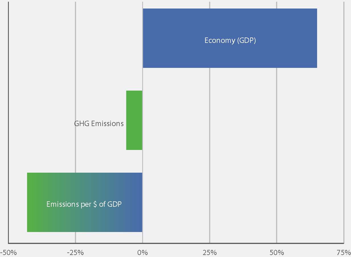
Figure 3 shows the economy is one driver of emissions in Ontario. Other drivers such as population, housing stock and the number of passenger vehicles have all increased significantly since 1990. Yet, over the same period, emissions have declined.
Figure 3 - Changes in Key Drivers of Emissions, 1990-2012
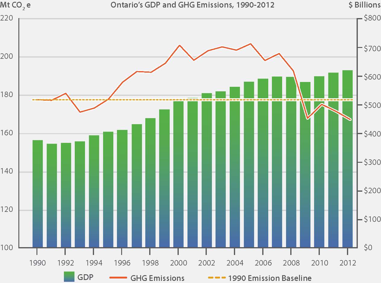
From 1990 to 2012, Ontario’s emissions fell by 5.9%; Figure 4 shows this long-term trend compared with GDP. Emissions grew from 1990 to the early 2000s, then stabilized and declined in recent years. Improved energy efficiency, the changing mix of electricity generation and the shifting composition of Ontario’s industrial base are mitigating the impact on greenhouse gas emissions of population and economic growth.
Figure 4 - Long-Term Trends
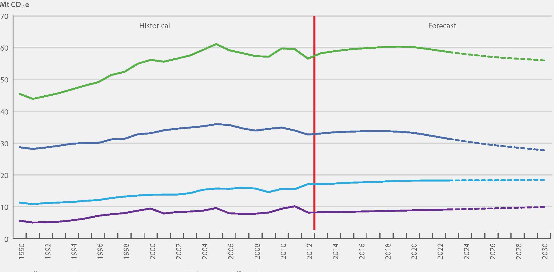
Short-term trends in Ontario’s emissions (2007 to 2012)
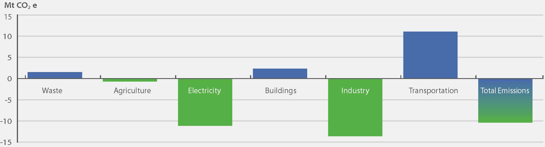
In 2007, Ontario released a Climate Change Action Plan that set out its emissions reduction targets and identified policies intended to help meet those targets. Since 2007, total emissions in Ontario have declined by approximately 34 Mt or 17%. The greatest reductions are in the electricity and industrial sectors (see Figure 5). The reduction in electricity is attributable to the phasing out of coal-fired electricity generation. The reduction in the industry sector is attributable to reduced production — including plant closures — and improved emissions intensity. Buildings’ emissions also declined as energy efficiency improved due to policies and programs in the sector. See Section 2 for more detail on sectorial trends.
Figure 5 - Short-Term Changes in Ontario Emissions by Sector, 2007 to 2012
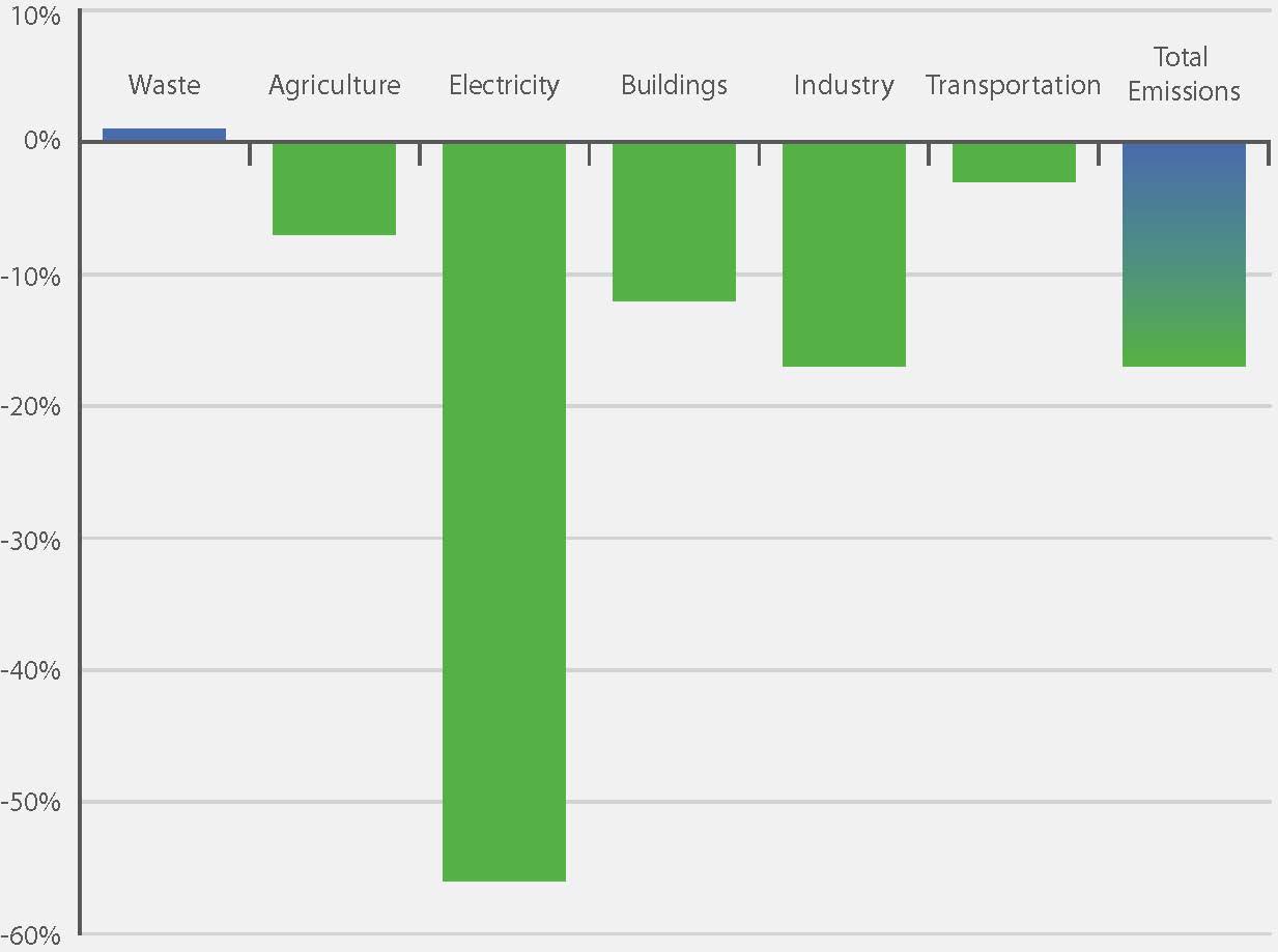
Source: the 2014 National Inventory Report: 1990 to 2012 data
Emission Intensities
Emission intensities across most sectors improved between 1990 and 2012, which indicates a trend towards a less carbon-intense economy. Figure 6 depicts emission intensities based on greenhouse gas drivers such as buildings, electricity, industry and transportation. Trends in specific sectors are described in more detail in Section 2 of this report.
Transportation
Between 1990 and 2012, emissions per passenger vehicle kilometre travelled in Ontario decreased by 18% while emissions per freight tonne-kilometre decreased by 45%. Passenger vehicle intensity saw most of its decrease after 2006. Most of the improvements in freight intensity occurred before 2000.
Industry
In the industrial sector, most emissions are generated by manufacturing industries. Figure 6 shows the emission intensity of overall manufacturing, calculated as emissions per dollar of manufacturing GDP. In 2012, emissions intensity was 34% lower than in 1990. Note that this figure does not show the variability across the sector and should not be taken to mean that every industry has reduced its emissions since 1990.
Figure 6: Changes in Emission Intensities of Key Activities, 1990–2012
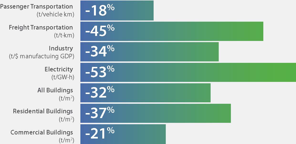
Sources: the 2014 National Inventory Report: 1990–2012 data; National Energy Use Database (2014);
Statistics Canada CANSIM Tables 127 0001 and 127 0007; Ontario Ministry of Finance, Long-Term Report on the Economy (2014)
Buildings
In the buildings sector, the measurement of emissions per unit of floor space gives an indication of changes in the “carbon intensity” of the sector, which is linked to energy use and the type of energy being used. Figure 6 shows changes in emission intensity, measured as emissions per square metre of floor space in residential and commercial/institutional buildings.
Building emission intensities improved by about 32% from 1990 to 2012, in both the residential (37%) and the commercial/institutional (21%) sub-sectors.
Electricity
In the electricity sector, emissions per unit of electricity generated (tonnes per gigawatt-hour) give an indication of changes in the emission intensity of electricity generation at Ontario’s utilities. Figure 6 shows changes in the emission intensity relative to the base year 1990.
Emission intensity improved by about 53% from 1990 to 2012. This means that greenhouse gases (tonnes of carbon dioxide equivalent) per gigawatt-hour of electricity generated was less than half what it was in 1990.
Figure 7 - Changes in GHG Emissions, 1990 to 2012 (Ontario and the Rest of Canada)
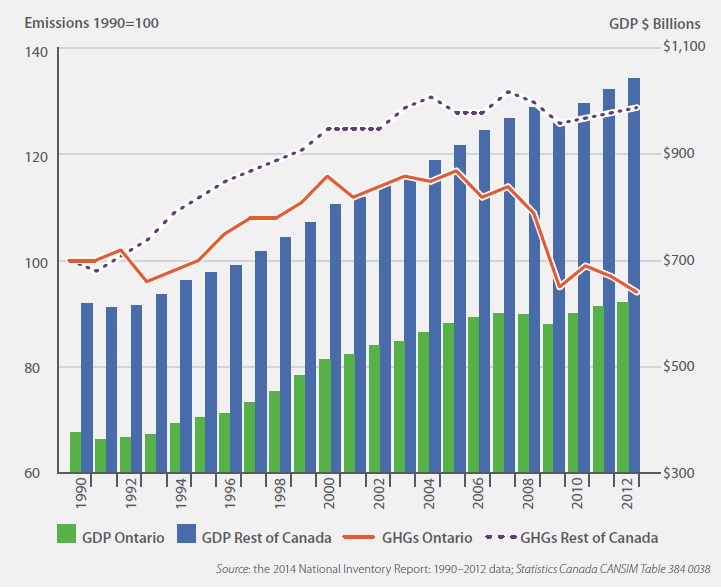
Source: the 2014 National Inventory Report: 1990 to 2012 data; Statistics Canada CANSIM Table 384 0038
Interprovincial Comparisons
Greenhouse gas emission trends across Canada are quite different than those in our province, with clear increases in areas of expanded resource development and slower growth or decreases in other areas. Overall, Canada’s emissions have increased 18.2% since 1990 but have declined in recent years, primarily because of the significant reductions in Ontario. Figure 7 compares emission changes in Ontario to those of Canada overall.
Emission profiles and trends vary significantly across Canada. Figure 8 shows the change in emissions by province since 1990.
Figure 8 - Provincial/Territorial Emissions, 1990 and 2012
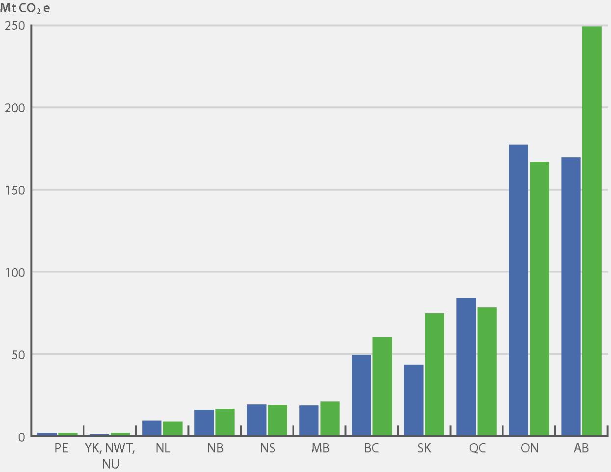
In contrast to Ontario’s stable-to-declining emissions, the national trend is one of increasing emissions. In 2012, Canada’s GHG emissions totalled 699 Mt, an increase of 18% since 1990. However, increases by province vary. Ontario and Quebec are the only jurisdictions in Canada with significantly declining greenhouse gas emissions. Ontario’s emissions decreased by 6% and Quebec’s decreased by 7%. In absolute emissions, Ontario’s decrease of 10 Mt since 1990 is the largest in Canada.
Both the emission intensity of Ontario’s economy — measured as emissions per unit of GDP — and per capita emissions are among the lowest in Canada (see Table 2).
| Province/Territory | Emission Intensity of the Economy (Mt CO2 eq./$ billion GDP) |
Rank |
|---|---|---|
| QC | 0.24 | 1 |
| YK, NWT, NU | 0.27 | 2 |
| ON | 0.27 | 3 |
| BC | 0.29 | 4 |
| NL | 0.32 | 5 |
| MB | 0.39 | 6 |
| PEI | 0.40 | 7 |
| NS | 0.53 | 8 |
| NB | 0.58 | 9 |
| AB | 0.86 | 10 |
| SK | 1.28 | 11 |
| Province/Territory | Emissions per Capita (t/capita) |
Rank |
|---|---|---|
| QC | 9.69 | 1 |
| ON | 12.32 | 2 |
| BC | 12.96 | 3 |
| PEI | 13.30 | 4 |
| MB | 16.63 | 5 |
| NL | 17.03 | 6 |
| YK, NWT, NU | 17.92 | 7 |
| NS | 20.03 | 8 |
| NB | 21.70 | 9 |
| AB | 63.81 | 10 |
| SK | 68.84 | 11 |
Sources: the 2014 National Inventory Report: 1990–2012 data; Statistics Canada CANSIM Tables 051 0001 and 384 0038
Emission Forecast to 2030
Figure 9 shows historical and forecast emissions for the province out to 2030. This forecast takes into consideration provincial and federal policies up to March 2014 that are expected to affect emissions, including Ontario’s regional transportation plan for the Greater Toronto and Hamilton Area.
In addition, in order to illustrate the progress Ontario is making towards its 2007 Climate Change Action Plan targets, a “business as usual” (BAU) emission projection is also forecast. The BAU is an estimate of what Ontario’s emissions would have been in the absence of policies introduced since CCAP. The BAU provides a reasonable estimate of what GHG emission levels would have been if the CCAP had not been in place, taking into account actual economic, demographic and activity trends.
Figure 9 - Ontario’s Historical and Forecast Emissions, 1990 to 2030
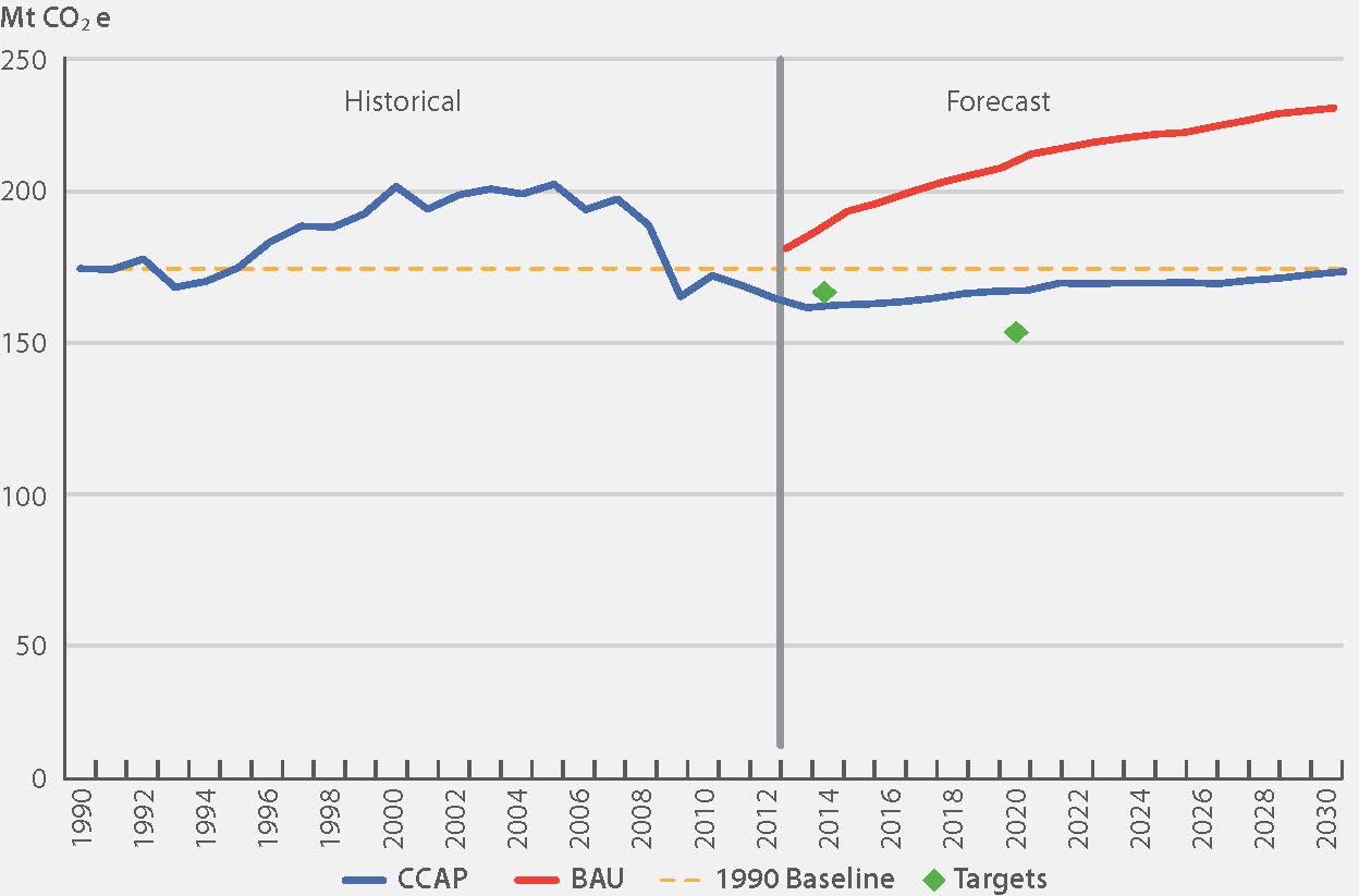
Table 3 shows the most recent forecast of progress to Ontario’s GHG targets. Since the 2012 progress report, Ontario’s progress to its greenhouse gas targets has improved. The main reason for these improvements is the 2013 revision of the Long-Term Energy Plan and its associated energy demand and clean energy generation forecasts. Furthermore, both the recent historical emission data and current economic forecasts are slightly lower than in 2012. Lower, more conservative economic forecasts tend to translate into lower emissions trends, since lower economic growth generally means lower energy-consuming activity and lower energy use.
| 2014 Update | 2014 | 2020 |
|---|---|---|
| Annual Projected Reductions (Mt) | 26 | 42 |
| Progress to Target | expected to surpass target | 69% |
| Gap (Mt) | expected to surpass target | 19 |
| 2012 Report | 2014 | 2020 |
|---|---|---|
| Annual Projected Reductions (Mt) | 31 | 42 |
| Progress to Target | 91% | 60% |
| Gap (Mt) | 3 | 28 |
Initiatives
Ontario has undertaken a wide range of initiatives to reduce greenhouse gas emissions throughout the economy. Examples from specific sectors will be highlighted in the sections following. Many efforts are inter-related (such as the phase-out of coal-fired electricity generation with increases in renewable generation and conservation) or have overlapping impacts (such as federal vehicle efficiency standards with Ontario’s ethanol blending requirements for gasoline). Therefore, estimated impacts are grouped by sector. Ontario’s climate change initiatives cross all emission sources and economic sectors and represent a combination of short-, medium- and long-term reductions. The initiatives considered for this report include activities that are both within and outside the direct control of the Ontario Government, including federal policies that affect provincial emissions. New initiatives announced after March 2014 have not been included in the forecast, such as Ontario’s proposal for Reducing Coal Use in Energy-Intensive Industries
Table 4 shows the expected impact of initiatives by sector in 2014 and 2020.
| Sector | Initiative | Projected Reductions - 2014 (Mt) | Projected Reductions - 2020(Mt) |
|---|---|---|---|
| Transportation |
|
1.9 | 4.6 |
| Industry | Natural gas utility conservation programs | 0.3 | 0.8 |
| Buildings |
|
0.9 | 2.3 |
| Electricity | Long-Term Energy Plan: coal phase-out; Feed-In Tariff program; residential, commercial and indus- trial demand management programs; and related electricity plans | 20.5 | 32.5 |
| Agriculture and Waste |
|
1.5 | 1.8 |
| All initiatives | 26.0 | 41.9 |
Emission reductions for all initiatives together may differ from the sum of individual initiative reductions due to interaction between them.
Section 2: Emissions By Sector
This section provides specific information about GHG emissions by sector, including a description of the main sources, drivers of trends, a sector-specific forecast and sectoral initiatives.
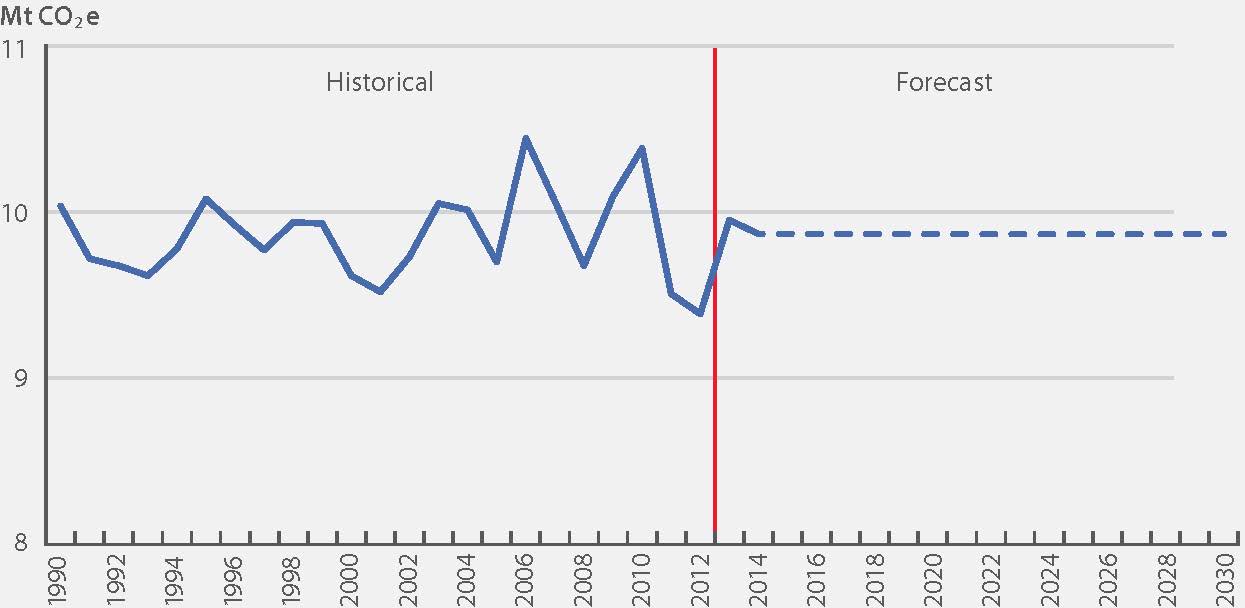
Transportation Sector
Transportation Emissions:
1990: 45.5 Mt
2012: 56.6 Mt
% Change: +24%
For 2012, the transportation sector represents approximately 34% of Ontario’s greenhouse gas emissions. Transportation GHGs are emitted from combustion of fossil fuels in vehicles, mainly gasoline and diesel, and mostly from road travel. The largest sources are passenger cars and light-duty trucks, accounting for over half of the sector’s emissions. The remainder come from other modes of transportation such as freight trucking and domestic air, ship and rail travel. International air and marine travel are not included in the Inventory. It should be noted that while public transit vehicles (i.e., buses, commuter trains, etc.) are sources of emissions, transit use contributes to reducing overall emissions levels by removing car trips from the road.
Trends
Emissions in the transportation sector have grown by 24% since 1990; road transportation is responsible for the greatest increase. Figure 10 shows how historical emission levels have changed from 1990 to 2012 for passenger vehicles and freight transportation compared to changes in the number of vehicles and amount of freight in tonne-kilometres. A tonne-kilometre represents the measure of freight [tonne] carried over the distance of a kilometre. Through the 1990s, emissions increased as travel increased with population and economic activity. Furthermore, specialization and globalization in the economy have increased the distances freight is shipped. Vehicle efficiency improvements, along with other policies, have contributed to these trends flattening in recent years.
Figure 10 - Historical Trends in Transportation
![Figure 10 shows how historical emission levels have changed from 1990 to 2012 for passenger vehicles and freight transportation compared to changes in the number of vehicles and amount of freight in tonne-kilometres. A tonne-kilometre represents the measure of freight [tonne] carried over the distance of a kilometre. Through the 1990s, emissions increased as travel increased with population and economic activity.](https://files.ontario.ca/climate-change-report-2014_img_9.jpg)
Source: the 2014 National Inventory Report: 1990–2012 data; National Energy Use Database (2014)
Impact Of Initiatives
Many policies contribute to more carbon-efficient transportation. Ontario’s Ethanol in Gasoline Regulation (O. Reg. 535/05) has improved vehicle emission intensities in recent years. The recently introduced Greener Diesel regulation promotes the use of diesel fuels with better environmental performance. Combined with federal fuel efficiency standards, these regulations are expected to continue to improve intensities. Speed limiter requirements for freight trucks also contribute modest reductions.
Investments in public transit; the Provincial Policy Statement, 2014; and Ontario’s Growth Plan encourage and promote a shift from individual car trips to car-pooling, land use, densities and mix of uses that minimize length and number of vehicle trips, and encourage the use of transit, walking and cycling — which in turn leads to fewer vehicle kilometres travelled and the associated emissions. For example, in 2012, there was an increase of more than 193 million passenger trips on municipal transit systems, compared to 2003. This has removed approximately 161 million car trips from Ontario roads.
Several major transit projects underway in the Greater Toronto and Hamilton Area (GTHA), Ottawa and Waterloo will come into service by 2020, which are projected to result in overall GHG reductions. As these lines mature and additional transit investments are made, positive impacts will continue beyond 2020.
Figure 11 shows forecast emissions from passenger, freight and off-road transportation out to 2030. The combined impact of transportation initiatives is forecast to be about 4 to 5 Mt from the business-as-usual projection in 2020. The impacts of current policies do not entirely offset increases that will come from population and economic growth, so near-term emissions are forecast to rise. However, emission growth after 2020 is expected to be tempered by increasing impacts of policies.
Figure 11 - Historical and Forecast Transportation Emissions
Source: the 2014 National Inventory Report: 1990–2012 data; MOECC forecast
Industrial Sector
In 2012, the industrial sector represents approximately 30% of Ontario’s greenhouse gas emissions. Emissions in this sector come from the combustion of fossil fuels, such as natural gas and fuel oil. Some industrial processes themselves emit greenhouse gases. For example, when limestone is transformed into clinker, a precursor to cement, the process releases CO2. These are called “process emissions.”
Large industrial emitters in Ontario are required to report their greenhouse gas emissions.
Industrial Emissions:
1990: 63.9 Mt
2012: 50.3 Mt
% Change: −21%
Trends
Ontario’s industrial emissions have dropped by 21% since 1990. In some cases, this was due to improvements in energy efficiency. This was also due to shifts in the economy from a predominance of manufacturing to a more diversified economy with a greater share of service industries. The overall improvement does not tellthe story of significant variability across industries. For example, pulp and paper production has declined significantly and so too have emissions. Ontario’s only adipic acid production plant reduced its emissions when it installed a catalytic emission abatement system in 1997. In 2009 this plant was indefinitely idled.
Figure 12 shows historical emissions from 1990–2012 and forecast emissions to 2030. Emissions decreased 10 Mt (17%) over the 2007 to 2012 period. This sharp drop was due to the recession; since then, emissions have been increasing. As the economy grows, it will be important to take the opportunity to find ways to level or decrease emission trends.
Figure 12: Industrial Emission Trend
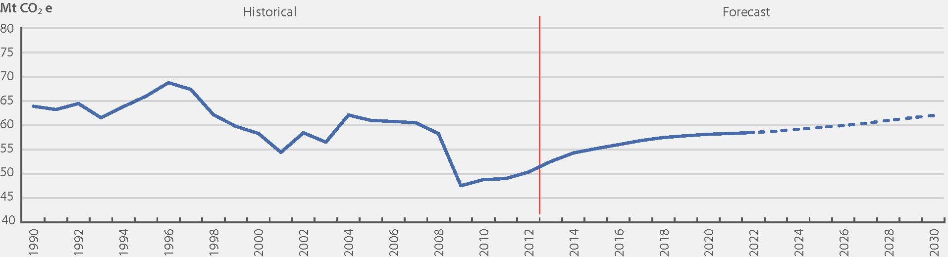
Source: the 2014 National Inventory Report: 1990 to 2012 data; MOECC forecast
In the industrial sector, most emissions are generated by the manufacturing subsector (see Section 3: Methodology for more detail). In 2012, the emission intensity of manufacturing industries, calculated as emissions per dollar of manufacturing GDP, was 34% lower than in 1990.
Impact Of Initiatives
By 2020, total industrial emissions are projected to increase by 15% from the 2012 level, both combustion and process emissions. The carbon intensity of those emissions, measured as emissions per dollar of manufacturing GDP, is projected to decrease. This expected future decrease will likely be consistent with an existing decreasing trend (see Figure 6).
Natural gas demand-side management programs are expected to reduce approximately 1 Mt of GHGs annually by 2020, compared to business as usual.
Looking ahead to 2020 and beyond, we will look to continue to work with industry towards the goals of clean-tech innovation and high resource productivity. Ideally, highly resource-efficient industries would increase profits and maintain a competitive edge in the global marketplace while reducing greenhouse gas emissions.
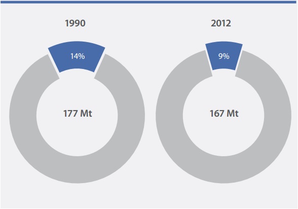
Buildings Sector
In 2012, the buildings sector represents approximately 17% of Ontario’s greenhouse gas emissions. This sector includes emissions related to fossil fuel combustion — primarily natural gas — for space heating, water heating and other direct emission sources in residential, commercial and institutional buildings. While buildings also use a significant amount of electricity for lighting, air conditioning and appliances, these are considered indirect emissions resulting from electricity use and are included in electricity sector emissions.
Buildings Emissions:
1990: 26.39 Mt
2012: 28.7 Mt
% Change: +9%
Trends
In Ontario, emissions in the buildings sector have grown steadily since 1990 along with population and the economy. These trends are expected to continue.
Figure 13 shows historical emissions from 1990 to 2012 and an emission forecast out to 2030. Annual fluctuations in historical emissions can be attributed to changes in heating demand due to weather and changes in activity in the commercial sector. Building emission intensity improved by about 32% from 1990 to 2012. This was due to improvements in both the residential (37%) and the commercial/institutional (21%) segments of the sector.
Figure 13 Buildings Sector Emission Trend
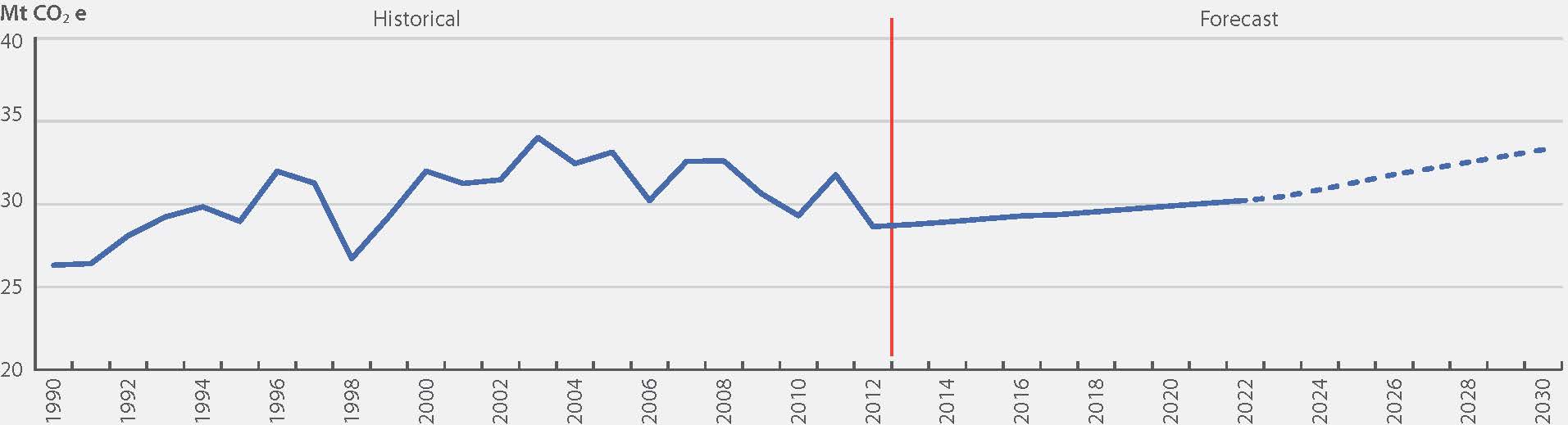
Source: the 2014 National Inventory Report: 1990–2012 data; MOECC forecast
Impact Of Initiatives
Recent changes to the Ontario Building Code mandate more efficient new buildings. For building stock already constructed, property owners have added insulation, sealed cracks, upgraded windows and have taken advantage of incentives from utilities and government. New furnace standards require higher efficiency appliances. As a result of these and other initiatives, the energy use per square metre in Ontario has decreased by more than 30% (see Figure 6, p. 10). The Provincial Policy Statement, 2014 promotes compact land use and development forms that will contribute to the reduction of greenhouse gas emissions from the building sector and the built environment. The expected combined impact of all of the activities described here will be about 2–3 Mt from the business-as-usual projection in 2020.
However, these improvements are not expected to completely counteract emission growth in building space overall — emissions are projected to rise in the coming years.
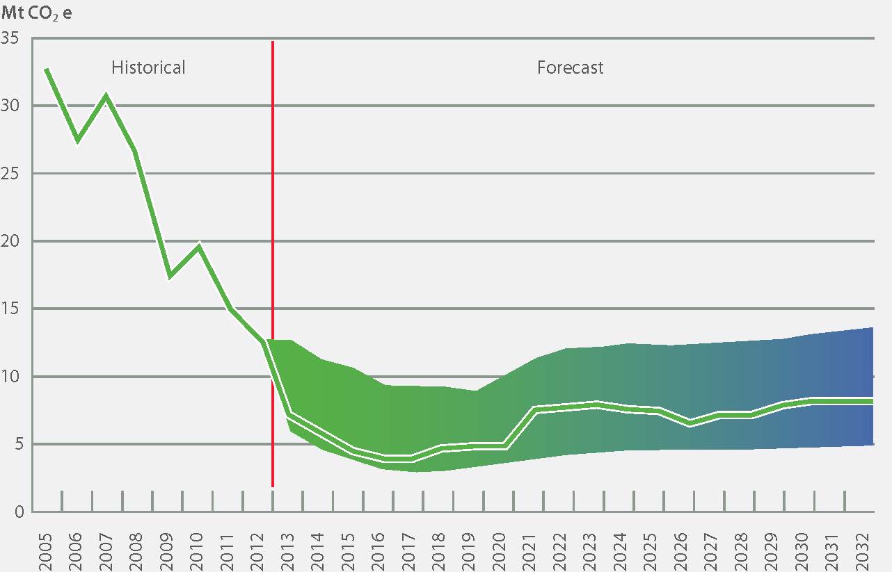
Electricity Utilities
In 2012, the electricity sector emitted approximately 9% of Ontario’s greenhouse gases. Greenhouse gases are emitted from electric generation burning fossil fuels — natural gas or coal in the province. Note that Ontario fully eliminated coal as a source of electricity generation in April 2014. Emissions from the sector are driven by the demand for electricity and the carbon intensity of the generation source.
Electricity Emissions:
1990: 25.5 Mt
2012: 14.5 Mt
% Change: −43%
Trends
There was a sharp increase in Ontario’s electricity emissions from the early 1990s to 2000, when coal-fired power plants represented a larger portion of energy generation. Emissions peaked in 2000 at around 70% above 1990 levels and have been decreasing ever since (see Figure 14).
Figure 14 - Electricity Generation Historical Emissions, 1990 to 2012
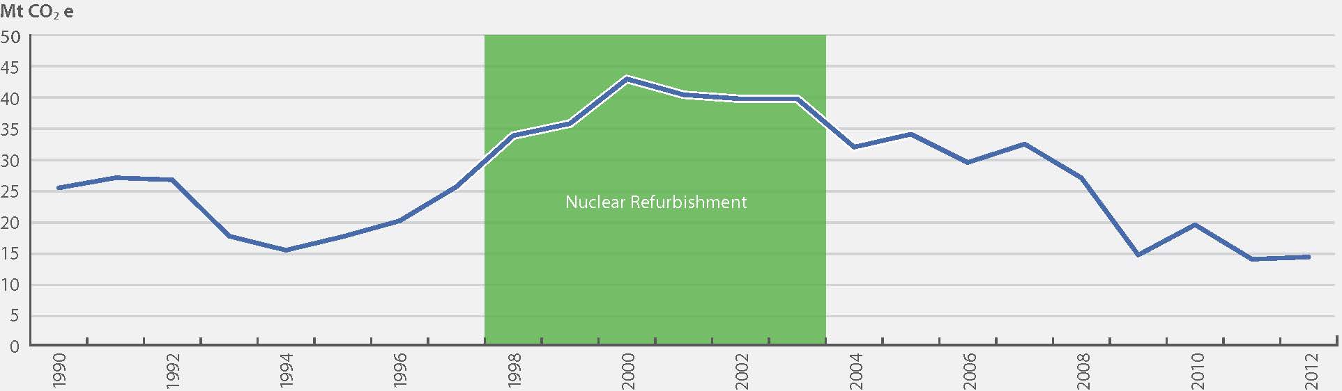
Source: the 2014 NationalInventory Report: 1990 to 2012 data
Since 2007, electricity emissions have decreased due to the phase-out of coal-fired electricity (see above). Emissions in 2012 were about the same as in 2011. Phasing out coal-fired electricity has improved the intensity of electricity in Ontario. Combined with demand management, this reduces the use of fossil fuels by electricity utilities.
Impact Of Initiatives
Phasing out coal-fired electricity generation is the single largest climate change initiative in North America to date and with associated electricity policies is projected to reduce Ontario’s emissions by 32.5 Mt in 2020 from business-as-usual (see Figure 15).
Figure 15 - Electricity Sector Greenhouse Gas Emission Forecast
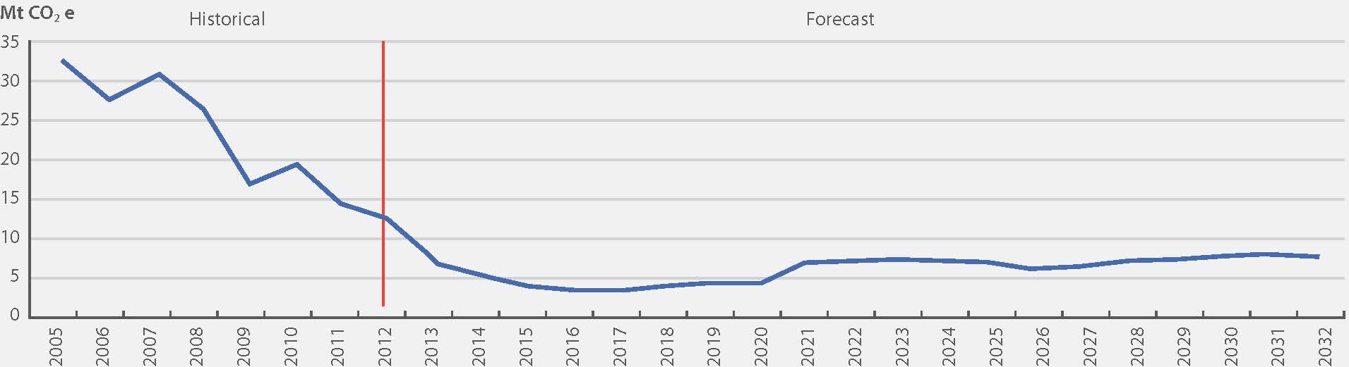
Source: Achieving Balance: Ontario’s Long-Term Energy Plan data (2013)
Between 2010 and 2014, the Ontario Government reduced the use of coal in power plants, closing or converting all generating units at these plants.The Green Energy and Green Economy Act, 2009 and the 2013 Long-Term Energy Plan have replaced coal with hydroelectric power, nuclear power, renewable electricity generation, demand management and conservation (see Figure 16). In the near term, the power grid will also rely on natural gas generation, so emissions from this sector many increase, especially during the refurbishment of some nuclear plants.
We also note that Ontario’s reductions in the carbon intensity of electricity generation means households, businesses and industries have a smaller carbon footprint. This change also provides opportunities for electricity to be a low-carbon alternative to other, more carbon-intense energy sources. For example, the carbon footprint of the operation of an electric vehicle in Ontario is substantially lower not only than that of a gasoline vehicle but also of an electric vehicle used in a jurisdiction dependent on coal-fired electricity.
In the future, we will continue to look to further develop Ontario’s clean energy sources and new technologies, as well as promote energy and resource efficiency and conservation across government, and among businesses and individuals.
Figure 16: Ontario’s Electricity Production by Source
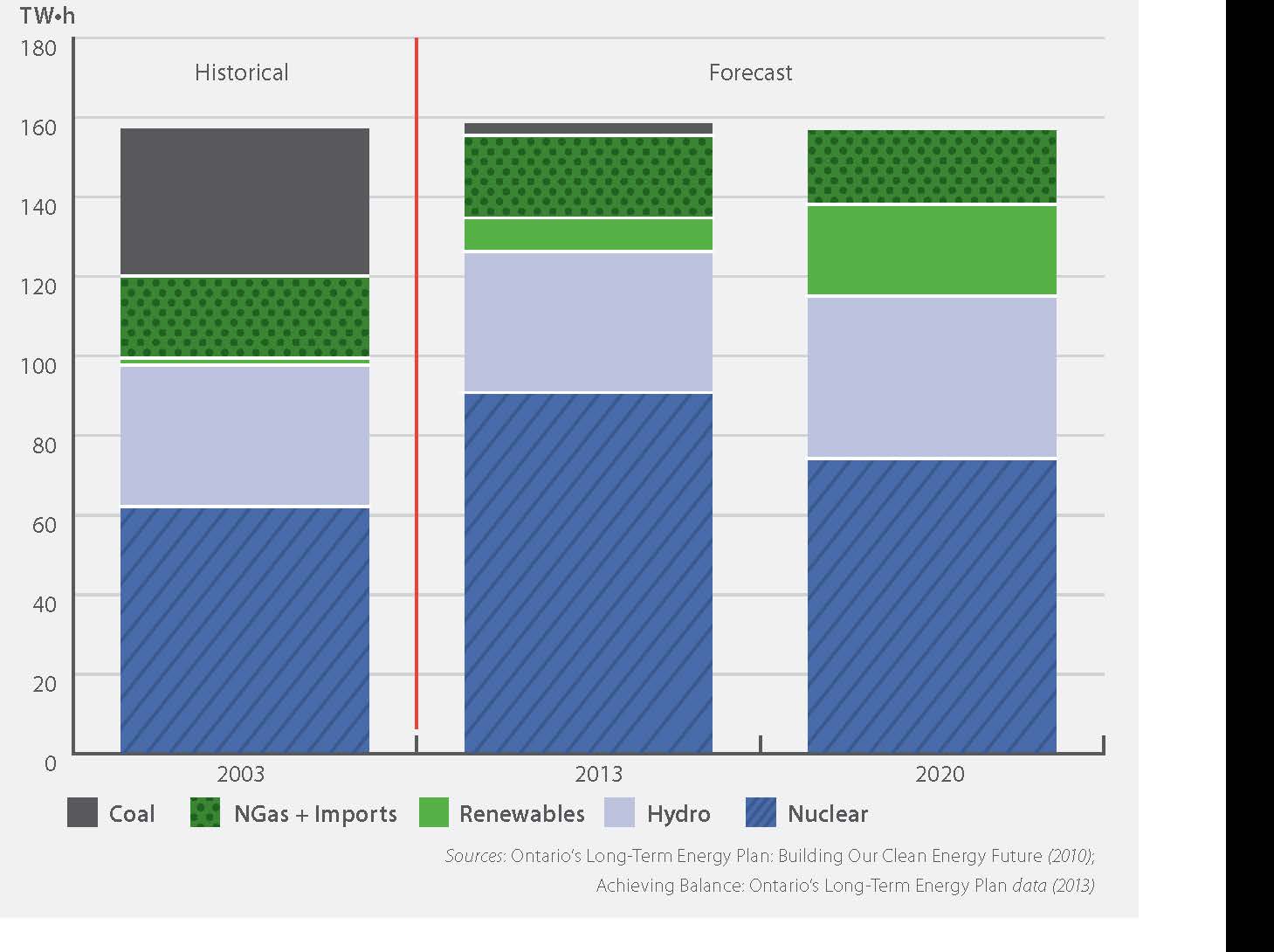
Sources: Ontario’s Long-Term Energy Plan: Building Our Clean Energy Future (2010);
Achieving Balance: Ontario’s Long-Term Energy Plan data (2013)
Agriculture Sector
Agriculture has numerous roles with respect to greenhouse gas emissions and the carbon cycle. Many agricultural activities are sources of GHG emissions, while others remove carbon from the atmosphere and store it in soils. According to the UN accounting conventions, emissions and removals of GHGs from agricultural lands are part of the Land Use, Land Use Change and Forestry (LULUCF) sector, which are estimated but not included in Inventory totals. Ontario does not include LULUCF emissions and removals in this report. Emissions from fossil fuels used in agricultural equipment like combines and tractors are included in the transportation sector, while emissions from fuels used to heat greenhouses are included in the industrial sector.
For the purposes of this report, emissions from the agriculture sector are restricted to livestock and crop production. A more detailed description of the sources can be found in the Inventory.
Agriculture Emissions:
1990: 10.0 Mt
2012: 9.4 Mt
% Change: −6.5%
Trends
In 2012, the agricultural sector was responsible for 9.4 Mt (6%) of total GHG emissions in Ontario (6.5% below 1990 levels). Most of the agricultural emissions accounted for in this sector are from the application of nitrogen-based fertilizers and manure to agricultural soils (55%), followed by methane from the digestive processes of livestock (enteric fermentation (29%)) and manure management (16%).
The agriculture sector emissions have remained fairly constant since 1990 (see Figure 17).
While the direct emissions from agriculture in Ontario are relatively small, the sector plays a critical role in the carbon cycle and the production of bio-fuels, which can displace fossil fuels in other sectors. On-farm biogas facilities (which were funded under the Ontario Biogas Systems Financial Assistance Program) are expected to achieve a reduction of 11 kilotonnes in 2020. Tillage practices can have an impact on emissions from agricultural soil; however, most of this impact is accounted for in the cropland category of the LULUCF sector and is not included in Ontario’s inventory or forecast at this time.
Figure 17: Agriculture Forecast Emissions to 2030
Source: the 2014 National Inventory Report: 1990–2012 data; MOECC forecast
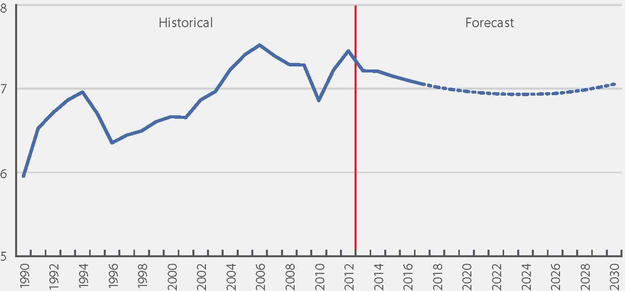
Waste Sector
Emissions from Ontario’s waste sector are primarily methane from the disposal of solid waste on land and, to a lesser extent, emissions from wastewater handling and waste incineration. Methane is generated from the decomposition of organic material over time in a landfill. The rate of methane generated depends on the amount and nature of the waste disposed and the conditions of the landfill.
Emissions from landfills are determined using a simulation model to account for the slow, long-term generation and release of these emissions.
Waste Emissions:
1990: 5.9 Mt
2012: 7.5 Mt
% Change: +25%
Trends
In 2012, the waste sector in Ontario was responsible for 7.5 Mt (4%) of the total GHG emissions in Ontario. Most of these (92%) came from methane emitted by public and private landfills. Figure 18 shows the emission trend and forecast for the waste sector. From 1990–2012, emissions grew by 25% as waste disposal on land increased. There are initiatives underway to reverse this trend that could be expanded; for example, by diverting organic matter from landfill and capturing or destroying the methane generated. Methane from landfill gas can also be used to generate electricity or heat.
Figure 18: Waste Forecast Emissions to 2030
Impact Of Initiatives
Waste emissions are expected to remain relatively stable in coming years. Ontario has implemented regulations
Section 3: Methodology
How Ontario estimates GHG emissions
Ontario’s approach reflects Canada’s National Inventory Report 1990 to 2012. Each year, Environment Canada submits an updated Inventory to the United Nations Framework Convention on Climate Change (UNFCCC) secretariat.
Historical emissions in Ontario’s report are taken from the latest Inventory, which covers the period 1990 to 2012. As discussed in the introduction, the data cover most activities in Ontario’s economy that influence GHGs but do not include impacts relating to land use, land-use change, and forestry at this time.
The Inventory uses numerous categories defined by UNFCCC reporting protocols. It is important to be aware that these often do not match categories used by many sources of economic, industrial and environmental data. For Ontario’s report, the categories are rolled up into six key sectors (see Table 1).
It should also be noted that international air and marine transport are currently not included in national inventories. In this report, the pipeline transportation of petroleum products is included in the industry sector. In addition to pipelines, the main non-manufacturing subsectors included in industry are mining, construction, energy emissions from agriculture and forestry. Emissions from manufacturing comprise more than two thirds of the industry sector, which is why its intensity is calculated using manufacturing GDP.
Improvements in the National Inventory Report
Environment Canada continually works to refine the data and methods used to estimate national and provincial emissions. These refinements lead to recalculations or re-statements of emission estimates for the whole time period of the Inventory (dating back to 1990). This means that provincial 1990 base year emissions and historical trends can change with each release of the Inventory — which consequently influences Ontario’s emission forecasts and assessment of progress. These recalculations and improvements are documented in each Inventory Report. The improvements made to the inventory since the 2013 report have not significantly changed Ontario’s overall emissions or their general breakdown.
Emission modelling overview
Ontario’s emission forecast has been updated to reflect new Inventory data, macroeconomic forecasts,
Reporting on the progress of Climate Change Action Plan initiatives and projecting future emissions are essential to understanding Ontario’s progress towards meeting its targets. Ontario’s model is updated periodically to incorporate the latest data available and refinements based on best practices. In addition, the projections of emission reductions are adjusted as required to incorporate data collection and changes to programs or policies.
This information was used to create:
- A Business-as-Usual (BAU) projection (assumes underlying historical emission trends continue without impact from reduction initiatives while taking account of the current economic and demographic outlook for Ontario)
- A Climate Change Action Plan (CCAP) projection (includes the anticipated future impact of emission reduction initiatives)
Uncertainty
The emission forecasts estimated in this report are based on a single set of economic, demographic, energy, and policy assumptions (except for the absence of policies in the BAU case). As with any modelling of this kind, there are significant uncertainties inherent in this projection.
Projections used to forecast Ontario’s emissions usually start with historical emissions. Historical data from the Inventory are estimates of emissions of each greenhouse gas in each sector in each year. They are subject to a range of uncertainties.
Although the uncertainty in Ontario’s forecast is not quantified, the following points can be made about the forecast:
- Trends over time should be less uncertain than individual years
- Policy case emissions should be less uncertain than BAU
- Total aggregate emissions should be less uncertain than sectoral emissions
- Nearer-term (pre-2020) emissions should be less uncertain than later (post-2020) emissions
As a rough example of the model’s sensitivity, if in 2020 both real GDP and population were 1% higher than forecast, the projected non-electricity emissions would be almost 1 Mt greater (about 0.5% of non-electricity emissions). This change is a generalized effect — the increase could be significantly higher or lower depending, for example, on whether energy- intensive manufacturing’s output is higher than that of the service sector.
On the electricity side, the 2013 Long-Term Energy Plan contains a reasonable range for the projected sector emissions (see Figure 19). Electricity emissions are sensitive to weather — more frequent hot summer afternoons, especially combined with higher GDP, would increase emissions much further.
Figure 19 - Range of Electricity Sector GHG Emissions
Third-party validation
To provide confidence in the province’s forecasts, Ontario has periodically had its emission forecasting methodology and assumptions validated by independent third parties. Starting in 2009, Ontario was the first jurisdiction to undertake a validation of its forward-looking emission reduction forecasts. Validation ensures these are reasonable and align with best practices where available. For Ontario’s 2012 climate change report, Ontario retained Navius Research Inc., who concluded the estimates were a fair representation of greenhouse gas forecasts using current best practices in GHG emission forecasting and evaluation of GHG mitigation programs.
Learn more about Ontario’s efforts to address climate change by visiting the website.
Footnotes
- footnote[1] Back to paragraph Ontario, Go Green: Ontario’s Climate Change Action Plan (Toronto: Queen’s Printer for Ontario, 2007).
- footnote[2] Back to paragraph 5.9% is the per cent reduction. This number is the accurate ratio when using the unrounded numbers; in 1990, actual emissions were 177,248 Mt and in 2012 were 166,878 Mt.
- footnote[3] Back to paragraph Bill 9, Ending Coal for Cleaner Air Act, 2014, 1st Session, 41st Legislature, Ontario.
- footnote[4] Back to paragraph Progress is calculated as the ratio of projected reductions in emissions (from Business as Usual) to reductions required to meet the target.
- footnote[5] Back to paragraph Environment Canada’s National Inventory Report 1990–2012: Greenhouse Gases Sources and Sinks, released in April 2014
- footnote[*] Back to paragraph YK, NWT, NU's emission intensity is lower. When rounding the number, it appears to be equal to Ontario.
- footnote[6] Back to paragraph The transportation plan is called The Big Move: Transforming Transportation in the Greater Toronto and Hamilton Area (November 2008 Metrolinx); updates to the plan as of February 2013 were also incorporated.
- footnote[7] Back to paragraph Environmental Bill of Rights Registry Number 012 1559.
- footnote[8] Back to paragraph Building Opportunity and Securing Our Future Act (Budget Measures), 2014, S.O. 2014, c. 7. Note that any projects included in The Big Move and funded out of Moving Ontario Forward are included in the current emissions projections. Many projects that have already been announced in the Greater Golden Horseshoe Growth Plan have also been included in estimates.
- footnote[9] Back to paragraph The regional transportation plan is an official long-term plan, produced by Metrolinx. However, capital projects are approved and funded individually as the plan is implemented over 25 years and may be subject to change. Therefore, modelling for this initiative is inherently more uncertain than for other initiatives.
- footnote[10] Back to paragraph The Green Commercial Vehicle Program ended in 2012.
- footnote[11] Back to paragraph O. Reg. 535/05 made under the Environmental Protection Act.
- footnote[12] Back to paragraph O. Reg. 97/14 made under the Environmental Protection Act.
- footnote[13] Back to paragraph O. Reg. 216/08; O. Reg. 217/08 made under the Environmental Protection Act.
- footnote[14] Back to paragraph Ontario’s industrial emitters’ report.
- footnote[15] Back to paragraph O. Reg. 216/08; O. Reg. 217/08. Made under the Environmental Protection Act.
- footnote[16] Back to paragraph Canada’s updated Inventory submission to the United Nations Framework Convention on Climate Change (UNFCCC) secretariat..
- footnote[17] Back to paragraph Consistent with Ministry of Finance’s projections in Ontario’s Long-Term Report on the Economy (April 2014).
- footnote[18] Back to paragraph Consistent with Ministry of Finance’s projections in Ontario’s Long-Term Report on the Economy (April 2014).
- footnote[19] Back to paragraph Ministry of Energy, Achieving Balance: Ontario’s Long-Term Energy Plan (November 2013).
- footnote[20] Back to paragraph Metrolinx, The Big Move: Transforming Transportation in the Greater Toronto and Hamilton Area (November 2008); updates to the plan as of February 2013 were also incorporated. Note that, although the regional transportation plan is an official long-term plan, capital projects are approved and funded individually as the plan is implemented over 25 years and may be subject to change. Therefore, modelling for this initiative is inherently more uncertain than for other initiatives.
- footnote[21] Back to paragraph For a more detailed analysis of estimate uncertainty, see Annex 7 of the National Inventory Report 1990 to 2012 (2014).
- footnote[22] Back to paragraph Ontario, Climate Vision: Climate Change Progress Report (2012), Appendix C.